Bleed Design Studio — Rebranding Strabag Kunstforum


By loading the video, you agree to Vimeo's privacy policy. Learn more
By loading the video, you agree to Vimeo's privacy policy. Learn more

By loading the video, you agree to Vimeo's privacy policy. Learn more


By loading the video, you agree to Vimeo's privacy policy. Learn more


By loading the video, you agree to Vimeo's privacy policy. Learn more
By loading the video, you agree to Vimeo's privacy policy. Learn more
By loading the video, you agree to Vimeo's privacy policy. Learn more
Kategorie:
Branding
Auszeichnung:
Shortlist (2026)
Auftraggeber:in:
STRABAG ART
1. The Challenge
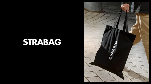
STRABAG ART manages 8,000+ works. Rebranding from STRABAG Kunstforum, the goal was balancing the industrial weight of construction parent STRABAG SE with contemporary art’s experimental nature, creating a credible platform for young artists.
2. The Solution
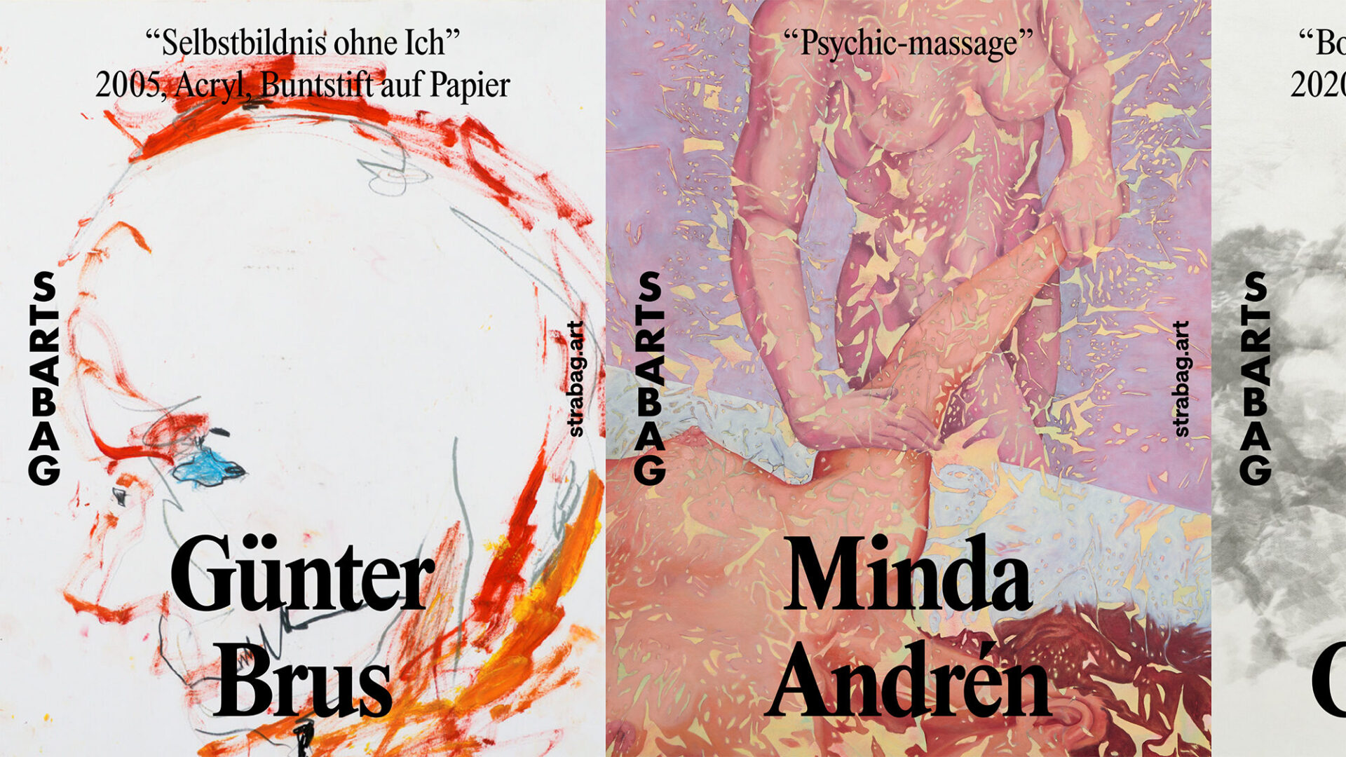
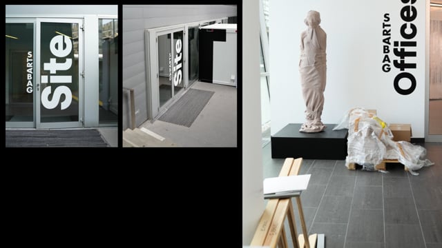
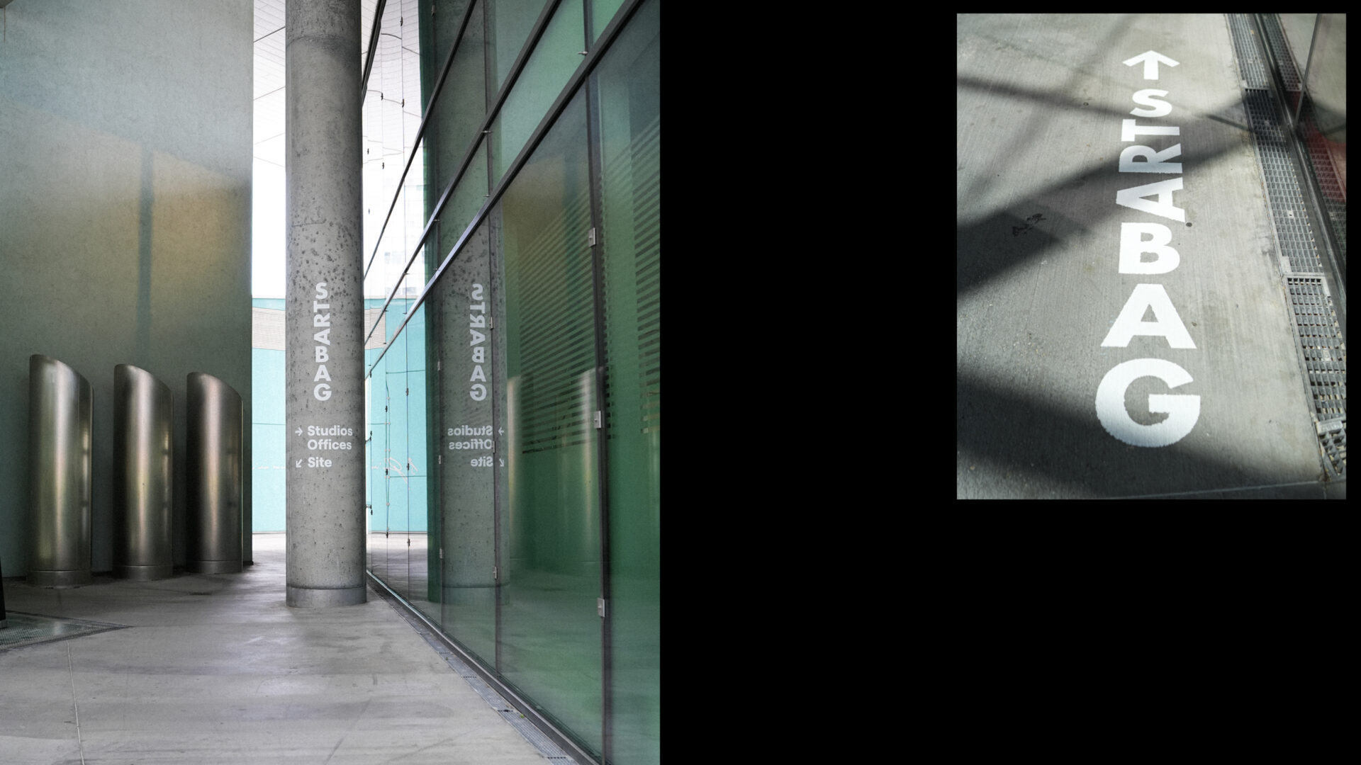
We structurally fused the corporate name and artistic core. By orienting “STRABAG” vertically and rotating the letters “T-R-A” 90 degrees, “ART” emerges as the backbone. Rigid industrial typography and an eccentric color palette create tension, mirroring the intersection of business and artistic vitality.
3. Design Choices
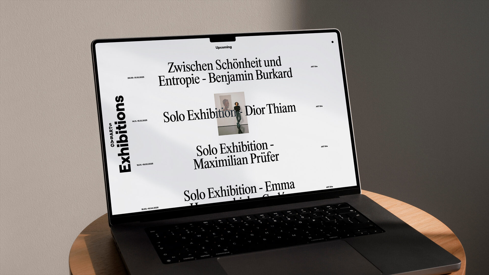
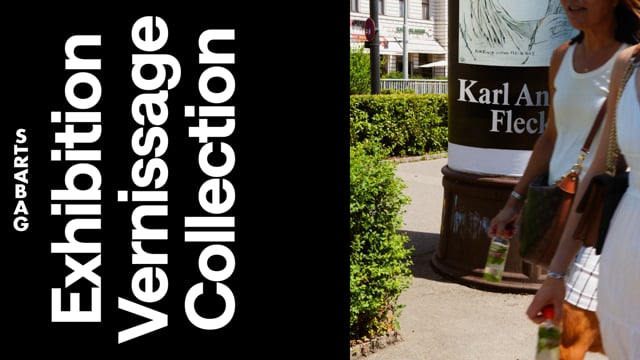
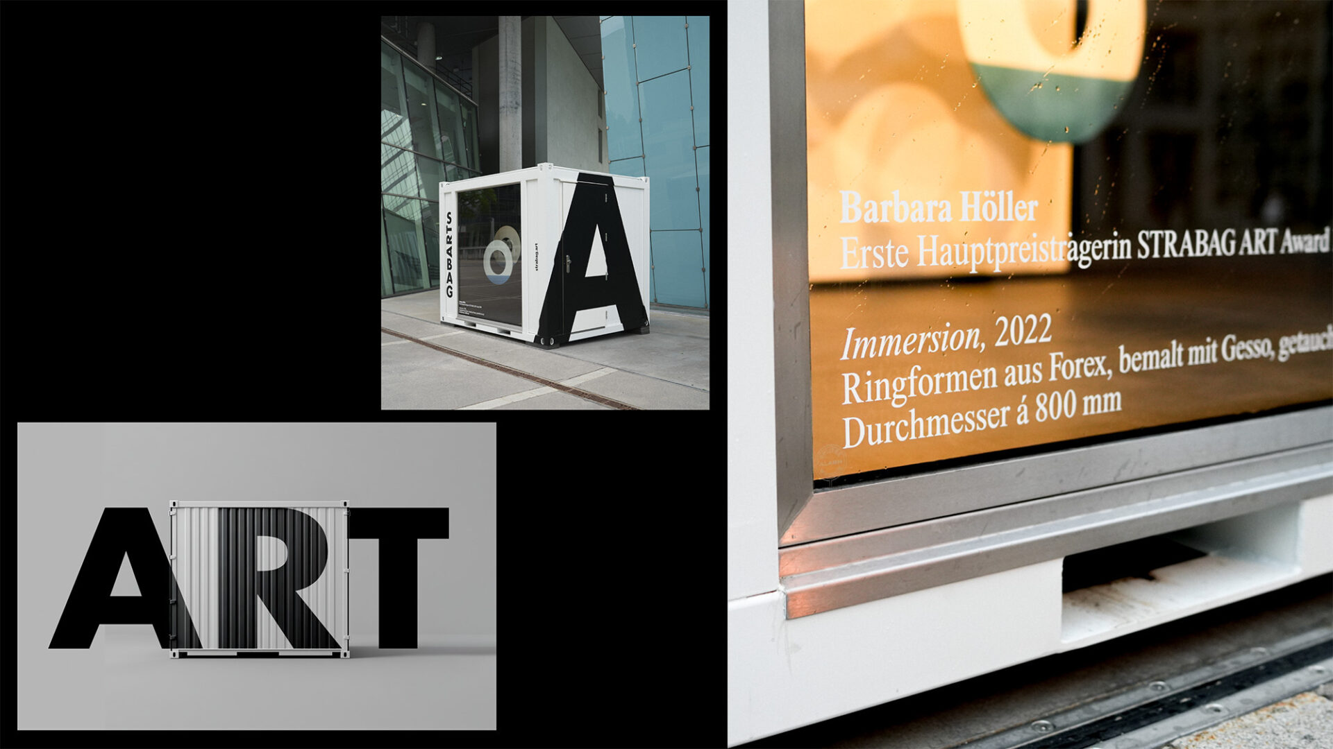
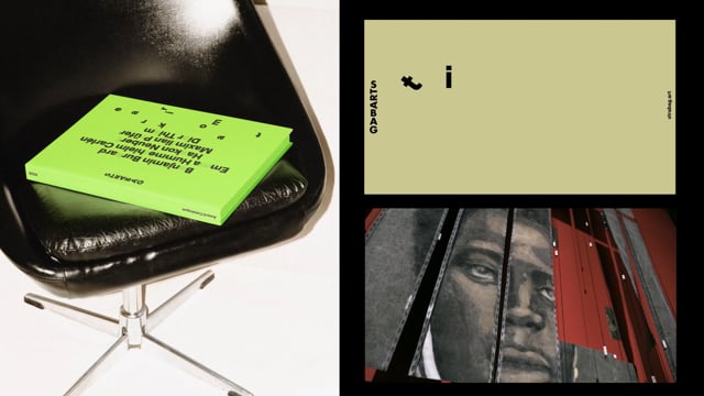
We centered the visual language on vertical tension. The friction between a bold grotesque and an ultra-narrow serif establishes a unique rhythm. A high-contrast palette provides a distinct voice while letting art set the tone. This vertical framework acts as dynamic infrastructure across all touchpoints—print, digital, and spatial—anchoring the brand while constantly foregrounding the art.
Creative Lead:
Bleed Design Studio (Wien)
Additional Creative Leads:
Bleed Design Studio / Oslo
Design Firm:
Bleed Design Studio
Design Firm:
Bleed Design Studio / Oslo
Creative Director:
Astrid Feldner, Svein Haakon Lia
Designer:
Jana Papiernikova, Daniel Schaffer-Ledolter, Daniel Bergsnes Nerheim, Lea Lindau
Illustrator:
Lucie Moriceau
Motion Designer:
Jørgen Holstad Andersen
Project manager:
Matthes Alpheis
Writer:
Benjamin Berglund